![KSF [Portfolio]](https://kavita.sparktechimagery.com/wp-content/uploads/2022/03/name-2-copy.png)

This project started a month after working with the company on their main product brochure, which took almost 12 months to complete during the peak of the pandemic back in 2021. This particular document had to be similar in the content but a complete 360 on the design, due to the regulations of their wholesale association.
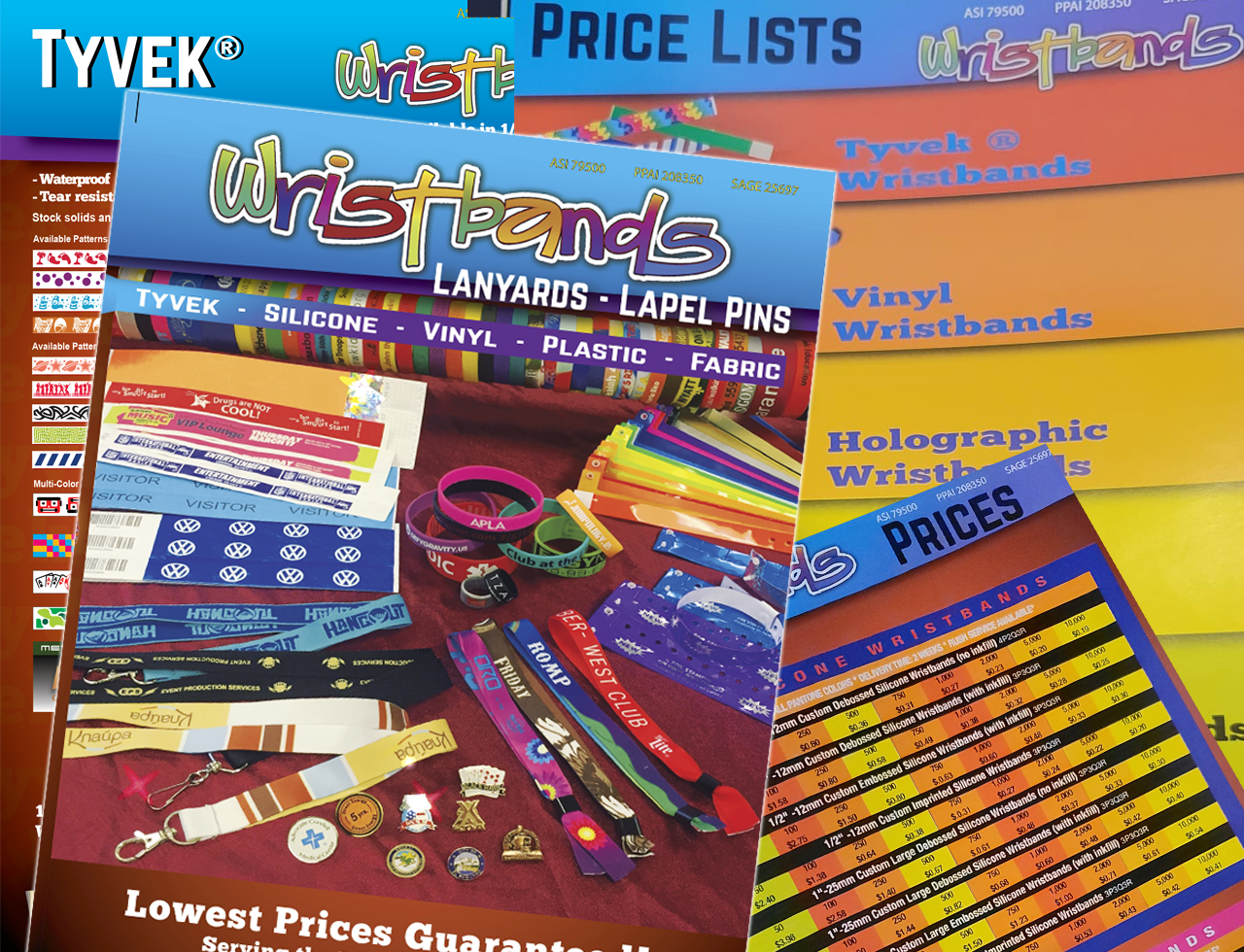
Their old brochure and price lists were filled with color. Which is good but seemed too much and felt disorganized with fonts and products. There was a theme of blue and orange. However, it felt difficult to read. The price list especially was difficult to navigate through also. Our goal was to keep the theory “less is more”.
So the re-design, the initial process, was getting the cover approved. Once that was complete flow and style could happen. It was a challenge after coming off the heavy branding content I just created to then make it completely different. It helped to have one of the directors sit with me for a few hours to get the ball rolling with the page designs.
Once that was in place, 3 days later we had a complete brochure ready for print! A week later – price list redesign updates. With the price list, instead of using multiple colors on every page, we chose colors to represent the various products listed. The colors were shown on the front cover and inside with the product category.
From the main brochure, we were able to put together quick business card layouts making their upcoming trade show effortless with their marketing materials.